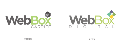
This article provides an insight into how we began from the meagre surrounds of a spare bedroom in Penarth 2008 to a dynamic digital team, providing professional digital services to over 400 clients globally. We also explore how we’ve recently changed the initial face of the brand (our logo) to be more reflective of who we now are and our aspirations.
Origins
WebBox Digital was set up by Will Roberts, our Managing Director whilst he was at the University of Glamorgan studying BSC (Hons) Computer Network Management and Security. The original idea behind the company name was a ‘ToolBox’ as it communicated how the company would cater to several services in one place. After much deliberation, the name was decided – ‘WebBox’.
The first client WebBox picked up was an English based online retailer of beds and mattresses, which came through an eBay advert (at that time company’s were able to promote their services as well as products). The result saw the creation of our first e-commerce website and we continued our relationship with them for another 4 years until the business was sold.
With the company growing we moved from the humble surroundings of a spare bedroom in Penarth to a serviced office in Cardiff and appointed our first 2 employees, a Developer and a Designer.
Year-on-year growth which included being awarded Google, Bing and SensioLabs partner status saw us outliving our Cardiff office and moving back home to Penarth into the building of a former Marine Merchants, where we reside to this day.
Our team now consists of 8 highly skilled digital specialists (designers, developers, digital marketers and project managers) who are able to solve the many varied digital projects we undertake.
Logo evolution
Design Process
Our approach to looking at the design of our logo, saw us using the Design Council’s ‘Double Diamond’ model which is divided into four distinct phases — Discover, Define, Develop and Deliver.
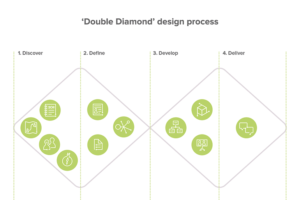
1. Discover
We first looked at the current logo, supporting assets e.g. colour palette and typography and the problems we were experiencing. This proved useful in gaining an insight into how a solution could be attained.
2. Define
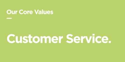
Next, we identified our core values, which ensured that the face of our brand (our logo) was a true reflection of who we are and aspire to be.
As part of this stage, we identified the importance of retaining brand awareness with our clients/target audience and made a conscious decision that the revision of the brand identity would be an evolutionary change, opposed to being a drastic alteration.
3. Develop
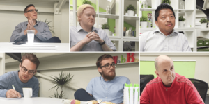
Within the third quarter of the ‘Double Diamond’ model, we then created a number of potential solutions, discussed them with the team and made subsequent iterations. This trial and error process helped us improve and refine the end solution. Team involvement was important to this process and we wanted all the staff to feel a sense of ownership with the brand.
4. Delivery
With a final logo being chosen we then set about producing the final outcome and applying it across all our brand marketing collateral. As part of this process, we created a set of brand guidelines which ensures longterm continuity.
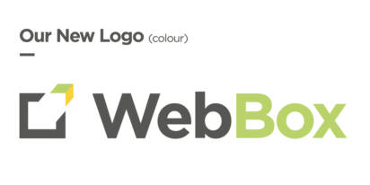
Logo Rationale
Typography
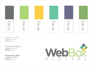
Our logo uses Gotham — a sans-serif digital typeface designed by American type designer Tobias Frere-Jones. Within our design process, we looked at several font families but it was the typeface, Gotham which was unanimously chosen due to the beautiful simplicity of the geometric nature of its letterforms. Additionally, we learnt from our previous logo that the use of 3 weights wasn’t providing the impact we required, setting us apart from our competitors, so a single emboldened weight was adopted.
Marque
The marque is a sympathetic progression from our former logo designed in 2012 — this achieves a key requirement within the Discovery phase of our process. A box shape is used with a piece of the area being detached, forming an arrow. Additionally, you’ll note within the space another arrow made from the negative space can also be seen. The purpose of the marque is to express the out of the box, forward-thinking nature of our company.
Colour
We followed a ‘less is more’ principle, ensuring legibility and visual impact by using just a limited palette of 3 specifically chosen colours.
If you would like to talk to us about how branding and how we could help your business grow, please get in touch with us today.