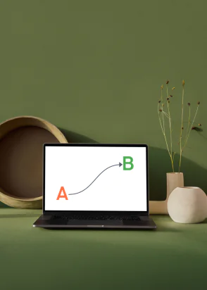
In our last post, we spoke broke down what you need to know about user journeys and website navigation, but what should you be doing to follow best practices and make your website easy to navigate? We’ve pulled together six of our top tips for when you’re planning your website so that users have the best possible experience.
-
If you can’t see it, you can’t click it!
Make it obvious where users should click. Want them to follow a CTA? Add a button or, perhaps, use your brand colours to make it clear. People don’t want to have to work too hard on a website, remember websites are meant to be easy to use.
-
Add in a dedicated navigation bar
In a similar vein, make sure that a user doesn’t have to search the whole website to find key information. By having a dedicated navigation bar users will be able to see how they’ve gotten to a certain page and how to get back if they change their mind.
-
Have a show-stopping sidebar
A sidebar means that no matter where your user is on the site they have quick access to navigation, without having to scroll through to get to where they want to go next. It can also be an opportunity to show of great design skills and make it stand out.
-
Clear and simple wins every time
The saying less is more really applies here. While you want your website to look good, that means nothing if it’s hard to navigate as users will get frustrated and go somewhere else! In fact, in a recent survey, 76% of users cited ease of use as an essential aspect of website design.
-
Don’t forget the footer!
Footers can be incredibly useful for displaying information, such as contact information, links to pages such as your privacy policy, careers pages and similar. For the best results think about adding a global footer so the information is always available.
-
Make mobile-friendly a priority
Think about it, how often do you look something up on your phone? In a recent survey it was noted that 70% of the searches made on mobile phones lead to online action. That’s not a margin that you want to miss out on.
This means that when you’re planning your website, make sure you test, test and test again, even checking different browsers for any issues. Make sure that when looking at a mobile version of the site you can quickly and easily navigate.
Want support creating a website that has easy navigation while sharing your business? Get in touch with our team for a chat and a brew today.